Graphing in Physics
Table of Contents
Most results in science are presented in scientific journal articles using graphs. Graphs present data in a way that is easy to visualize for humans in general, especially someone unfamiliar with what is being studied. They are also useful for presenting large amounts of data or data with complicated trends in an easily-readable way.
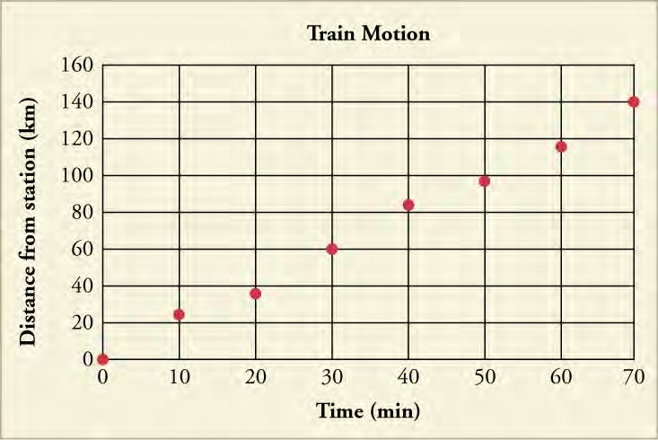
One commonly-used graph in physics and other sciences is the line graph, probably because it is the best graph for showing how one quantity changes in response to the other. Let’s build a line graph based on the data in Table 1.5, which shows the measured distance that a train travels from its station versus time. Our two variables, or things that change along the graph, are time in minutes, and distance from the station, in kilometers. Remember that measured data may not have perfect accuracy.
Time (min) Distance from Station (km)
| 0 | 0 |
| 10 | 24 |
| 20 | 36 |
| 30 | 60 |
| 40 | 84 |
| 50 | 97 |
| 60 | 116 |
| 70 | 140 |
- Draw the two axes. The horizontal axis, or x-axis, shows the independent variable, which is the variable that is controlled or manipulated. The vertical axis, or y-axis, shows the dependent variable, the non-manipulated variable that changes with (or is dependent on) the value of the independent variable. In the data above, time is the independent variable and should be plotted on the x-axis. Distance from the station is the dependent variable and should be plotted on the y-axis.
- Label each axes on the graph with the name of each variable, followed by the symbol for its units in parentheses. Be sure to leave room so that you can number each axis. In this example, use Time (min) as the label for the x-axis.
- Next, you must determine the best scale to use for numbering each axis. Because the time values on the x-axis are taken every 10 minutes, we could easily number the x-axis from 0 to 70 minutes with a tick mark every 10 minutes. Likewise, the y-axis scale should start low enough and continue high enough to include all of the distance from station values. A scale from 0 km to 160 km should suffice, perhaps with a tick mark every 10 km.
In general, you want to pick a scale for both axes that 1) shows all of your data, and 2) makes it easy to identify trends in your data. If you make your scale too large, it will be harder to see how your data change. Likewise, the smaller and more fine you make your scale, the more space you will need to make the graph. The number of significant figures in the axis values should be coarser than the number of significant figures in the measurements.
- Now that your axes are ready, you can begin plotting your data. For the first data point, count along the x-axis until you find the 10 min tick mark. Then, count up from that point to the 10 km tick mark on the y-axis, and approximate where 22 km is along the y-axis. Place a dot at this location. Repeat for the other six data points (Figure 1.26).
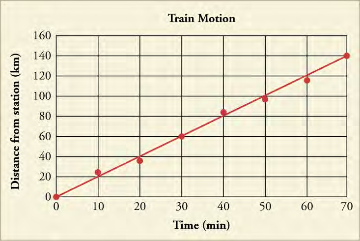
- Add a title to the top of the graph to state what the graph is describing, such as the y-axis parameter vs. the x-axis parameter. In the graph shown here, the title is train motion. It could also be titled distance of the train from the station vs. time.
- Finally, with data points now on the graph, you should draw a trend line (Figure 1.27). The trend line represents the dependence you think the graph represents, so that the person who looks at your graph can see how close it is to the real data. In the present case, since the data points look like they ought to fall on a straight line, you would draw a straight line as the trend line. Draw it to come closest to all the points. Real data may have some inaccuracies, and the plotted points may not all fall on the trend line. In some cases, none of the data points fall exactly on the trend line.
Analyzing a Graph Using Its Equation
One way to get a quick snapshot of a dataset is to look at the equation of its trend line. If the graph produces a straight line, the equation of the trend line takes the form

The b in the equation is the y-intercept while the m in the equation is the slope. The y-intercept tells you at what y value the line intersects the y-axis. In the case of the graph above, the y-intercept occurs at 0, at the very beginning of the graph. The y-intercept, therefore, lets you know immediately where on the y-axis the plot line begins.
The m in the equation is the slope. This value describes how much the line on the graph moves up or down on the y-axis along the line’s length. The slope is found using the following equation
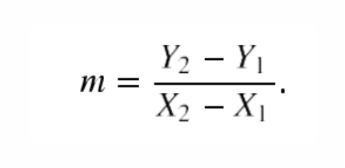
In order to solve this equation, you need to pick two points on the line (preferably far apart on the line so the slope you calculate describes the line accurately). The quantities Y2 and Y1 represent the y-values from the two points on the line (not data points) that you picked, while X2 and X1 represent the two x-values of the those points.
What can the slope value tell you about the graph? The slope of a perfectly horizontal line will equal zero, while the slope of a perfectly vertical line will be undefined because you cannot divide by zero. A positive slope indicates that the line moves up the y-axis as the x-value increases while a negative slope means that the line moves down the y-axis. The more negative or positive the slope is, the steeper the line moves up or down, respectively. The slope of our graph in Figure 1.26 is calculated below based on the two endpoints of the line
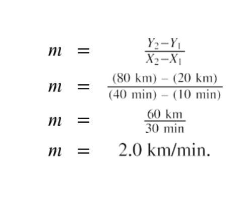
Equation of line : y = (2.0 km/min) x + 0
Because the x axis is time in minutes, we would actually be more likely to use the time t as the independent (x-axis) variable and write the equation as
y = (2.0 km/min) t + 0
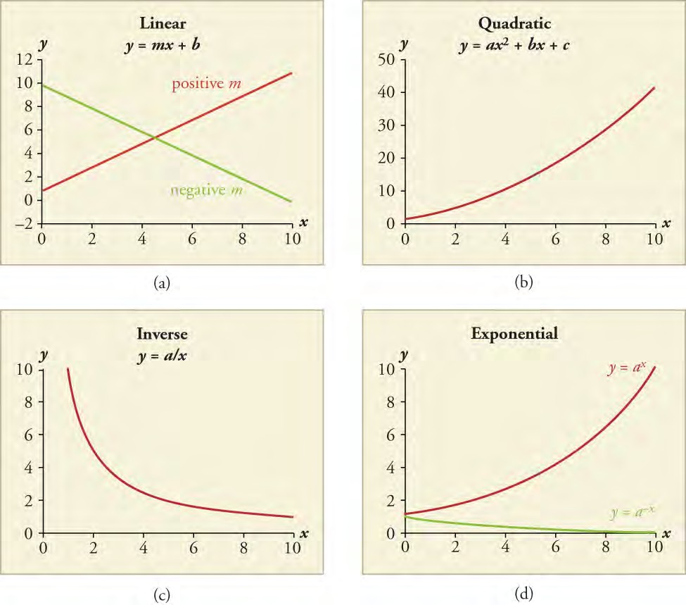
The formula y = mx + b only applies to linear relationships, or ones that produce a straight line. Another common type of line in physics is the quadratic relationship, which occurs when one of the variables is squared. One quadratic relationship in physics is the relation between the speed of an object its centripetal acceleration, which is used to determine the force needed to keep an object moving in a circle. Another common relationship in physics is the inverse relationship, in which one variable decreases whenever the other variable increases. An example in physics is Coulomb’s law. As the distance between two charged objects increases, the electrical force between the two charged objects decreases. Inverse proportionality, such the relation between x and y in the equation
y = k/x,
for some number k, is one particular kind of inverse relationship. A third commonly-seen relationship is the exponential relationship, in which a change in the independent variable produces a proportional change in the dependent variable. As the value of the dependent variable gets larger, its rate of growth also increases. For example, bacteria often reproduce at an exponential rate when grown under ideal conditions. As each generation passes, there are more and more bacteria to reproduce. As a result, the growth rate of the bacterial population increases every generation (Figure 1.28).
Using Logarithmic Scales in Graphing
Sometimes a variable can have a very large range of values. This presents a problem when you’re trying to figure out the best scale to use for your graph’s axes. One option is to use a logarithmic (log) scale. In a logarithmic scale, the value each mark labels
is the previous mark’s value multiplied by some constant. For a log base 10 scale, each mark labels a value that is 10 times the value of the mark before it. Therefore, a base 10 logarithmic scale would be numbered: 0, 10, 100, 1,000, etc. You can see how the logarithmic scale covers a much larger range of values than the corresponding linear scale, in which the marks would label the values 0, 10, 20, 30, and so on.
If you use a logarithmic scale on one axis of the graph and a linear scale on the other axis, you are using a semi-log plot. The Richter scale, which measures the strength of earthquakes, uses a semi-log plot. The degree of ground movement is plotted on a logarithmic scale against the assigned intensity level of the earthquake, which ranges linearly from 1-10 (Figure 1.29 (a)).
If a graph has both axes in a logarithmic scale, then it is referred to as a log-log plot. The relationship between the wavelength and frequency of electromagnetic radiation such as light is usually shown as a log-log plot (Figure 1.29 (b)). Log-log plots are also commonly used to describe exponential functions, such as radioactive decay.
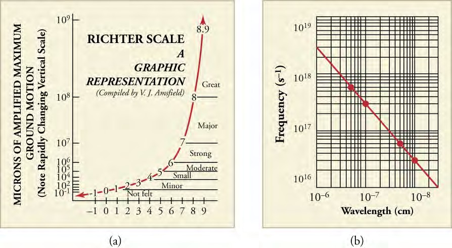
Figure 1.29 (a) The Richter scale uses a log base 10 scale on its y-axis (microns of amplified maximum ground motion). (b) The relationship between the frequency and wavelength of electromagnetic radiation can be plotted as a straight line if a log-log plot is used.
(You can access this textbook for free in web view or PDF through OpenStax.org, and for a low cost in print)
Take Quiz
1. How does the independent variable in a graph differ from the dependent variable?
a. The dependent variable varies linearly with the independent variable.
b. The dependent variable depends on the scale of the axis chosen while independent variable does not.
c. The independent variable is directly manipulated or controlled by the person doing the experiment, while dependent variable is the one that changes as a result.
d. The dependent and independent variables are fixed by a convention and hence they are the same.
ANSWER
c) The independent variable is directly manipulated or controlled by the person doing the experiment, while dependent
2) Velocity, or speed, is measured using the following formula: where v is velocity, d is the distance travelled, and t is the time the object took to travel the distance. If the velocity-time data are plotted on a graph, which variable will be on which axis? Why?
a. Time would be on the x-axis and velocity on the y- axis, because time is an independent variable and velocity is a dependent variable.
b. Velocity would be on the x-axis and time on the y- axis, because time is the independent variable and velocity is the dependent variable.
c. Time would be on the x-axis and velocity on the y- axis, because time is a dependent variable and velocity is a independent variable.
d. Velocity would be on x-axis and time on the y-axis, because time is a dependent variable and velocity is a independent variable.
ANSWER
a) Time would be on the x-axis and velocity on the y- axis, because time is an independent variable and velocity is a dependent variable.
3) The graph shows the temperature change over time of a heated cup of water.
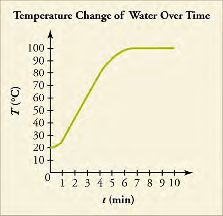
What is the slope of the graph between the time period 2 min and 5 min?
a. –15 ºC/min
b. –0.07 ºC/min
c. 0.07 ºC/min
d. 15 ºC/min
ANSWER
d) 15 ºC/min